


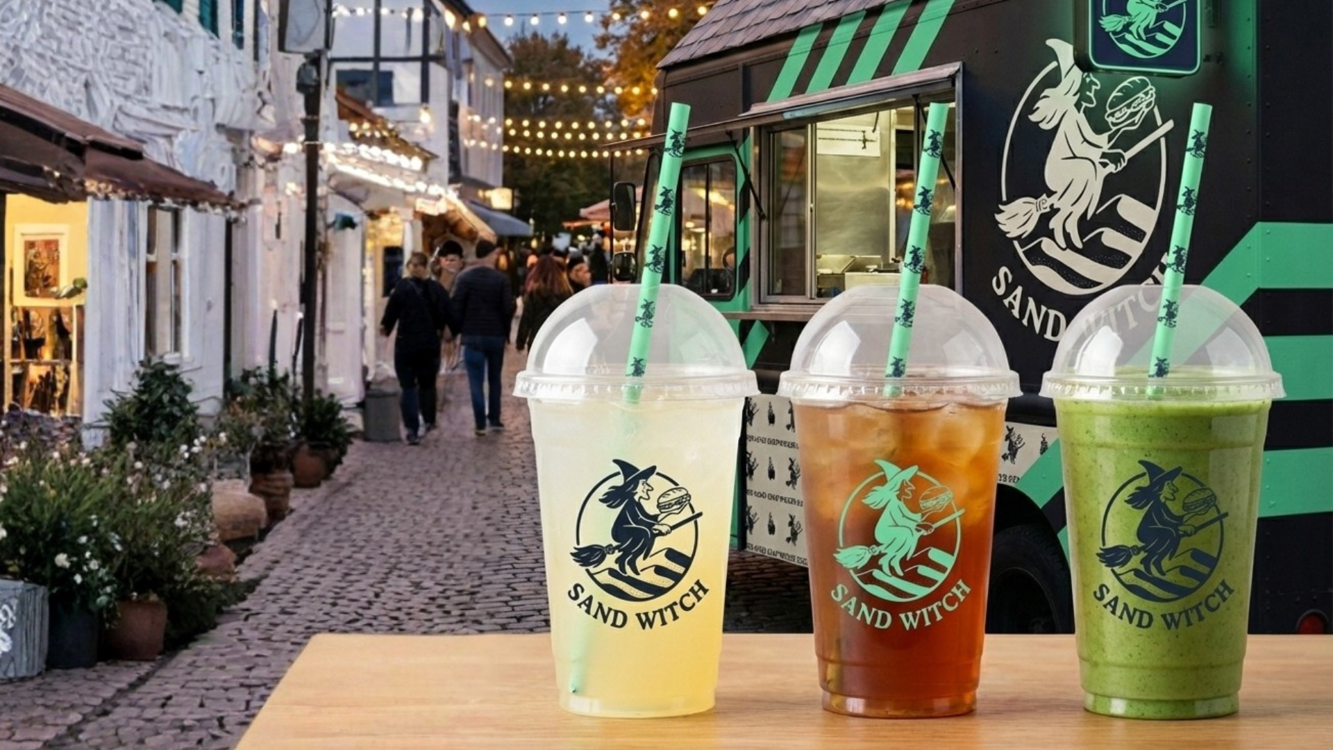
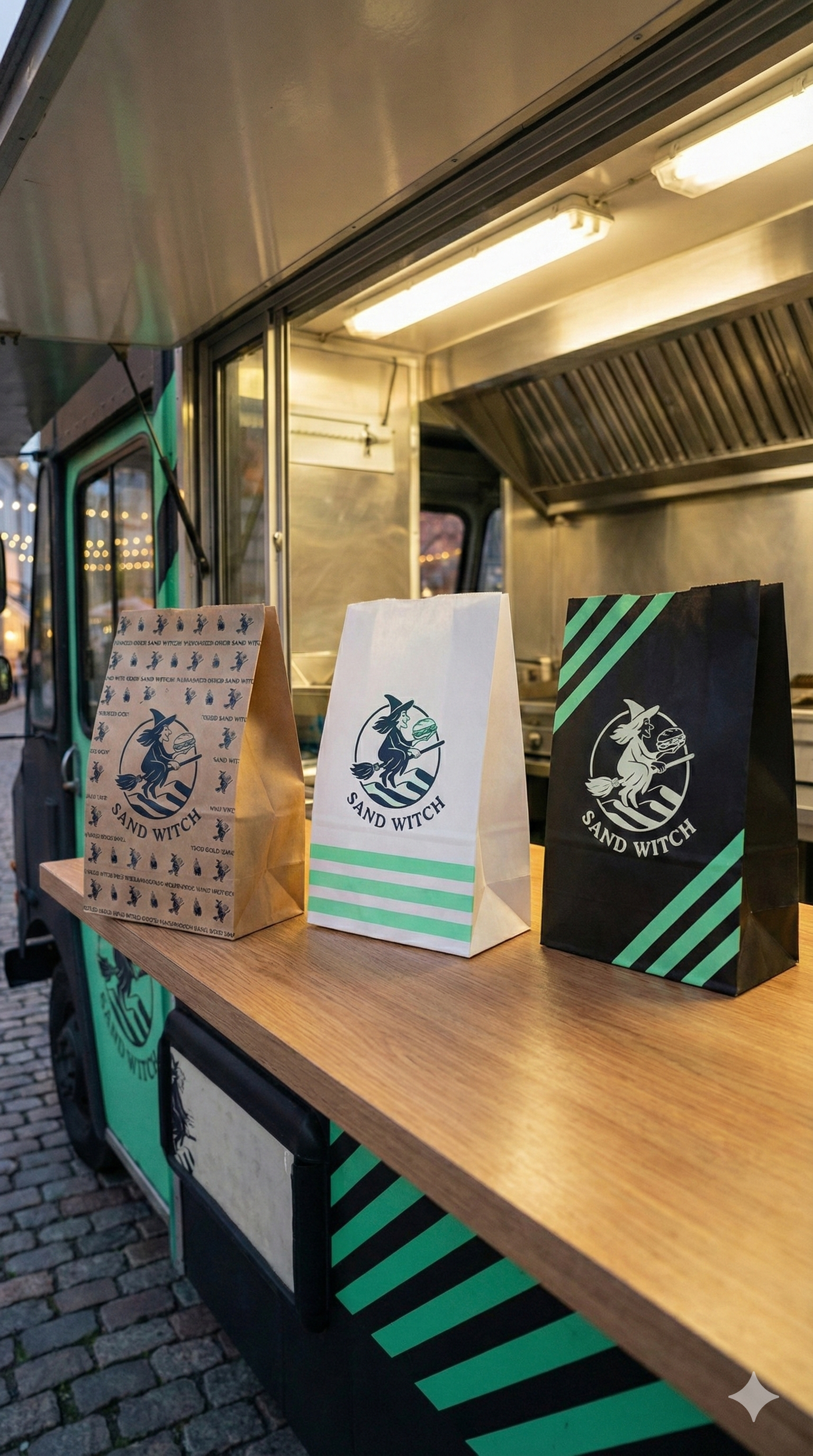
Sand Witch
Ideation and Brand book for a Sandwich food truck
A bold brand identity for a playful food truck built around a clever name.
The challenge was to celebrate the pun without compromising the premium culinary feel.
#Creative
#Design
#Strategy
#Brandbook
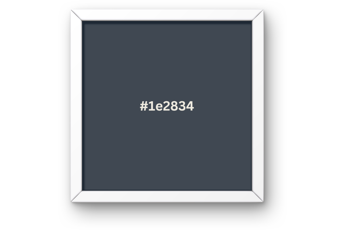
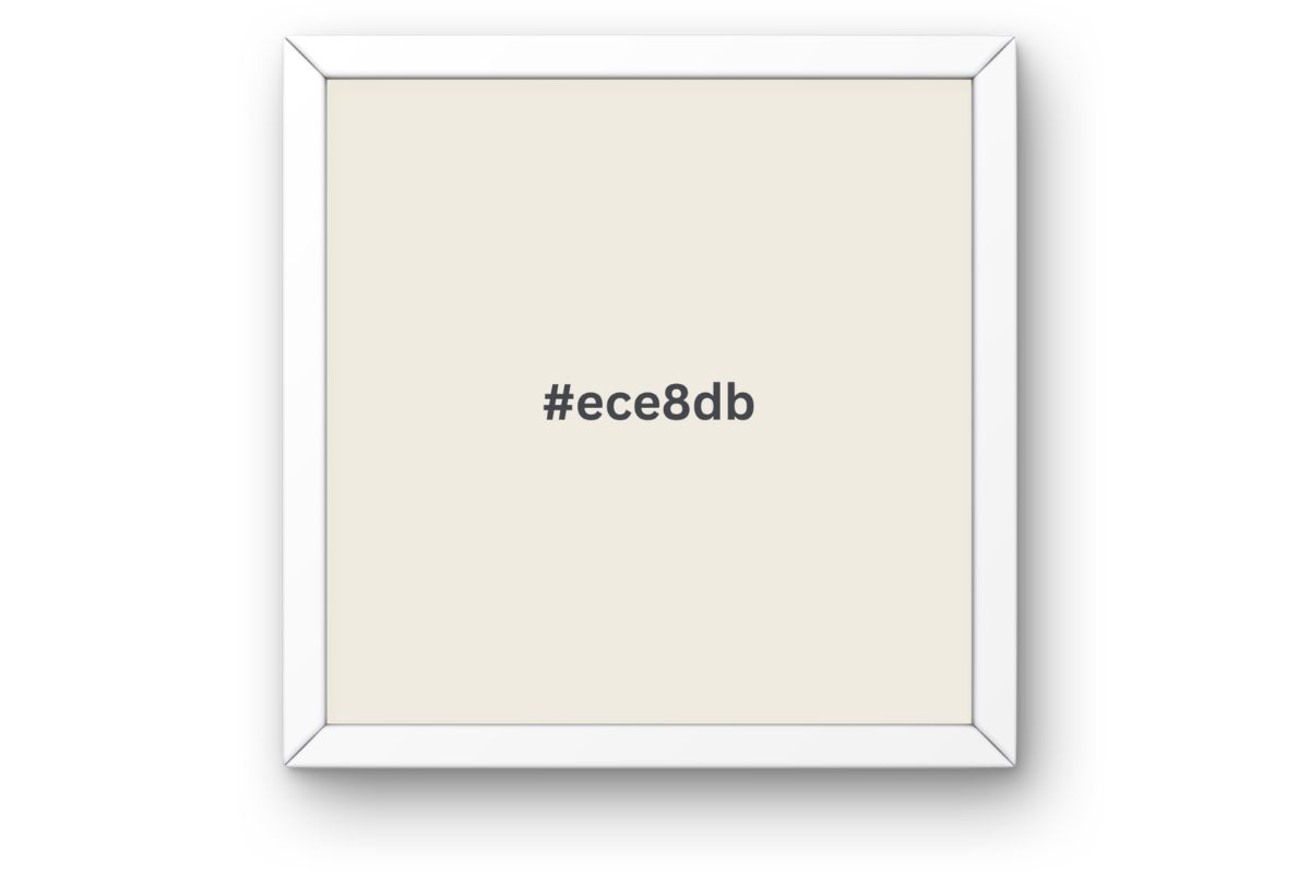
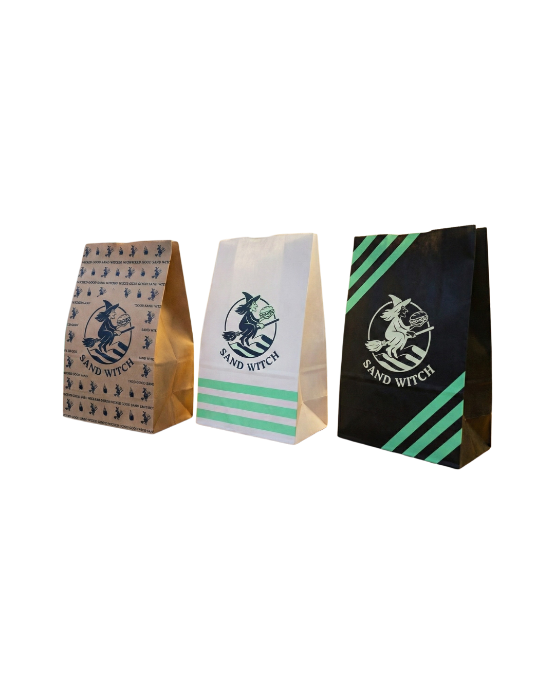
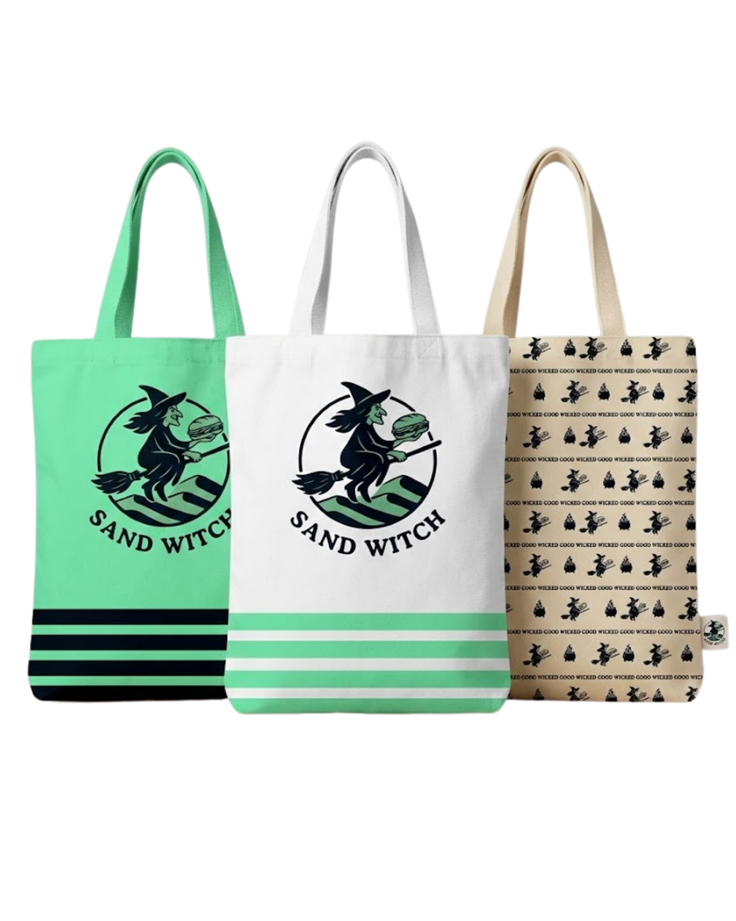
Mint green anchors the palette. Inspired by the classic “villain green” from animated worlds, reinterpreted into something fresh, inviting and contemporary.
It’s complemented by soft blue, beige, and sage tones that bring balance and warmth to the overall look.
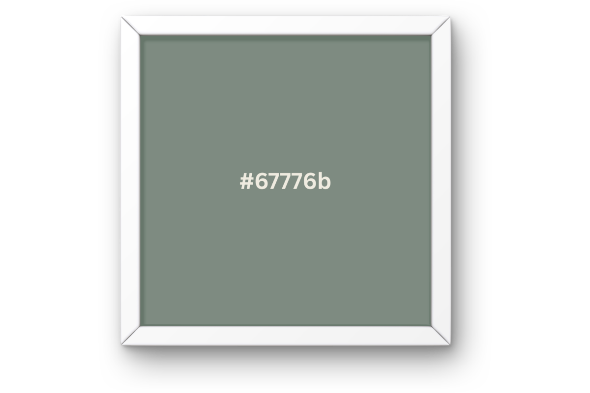
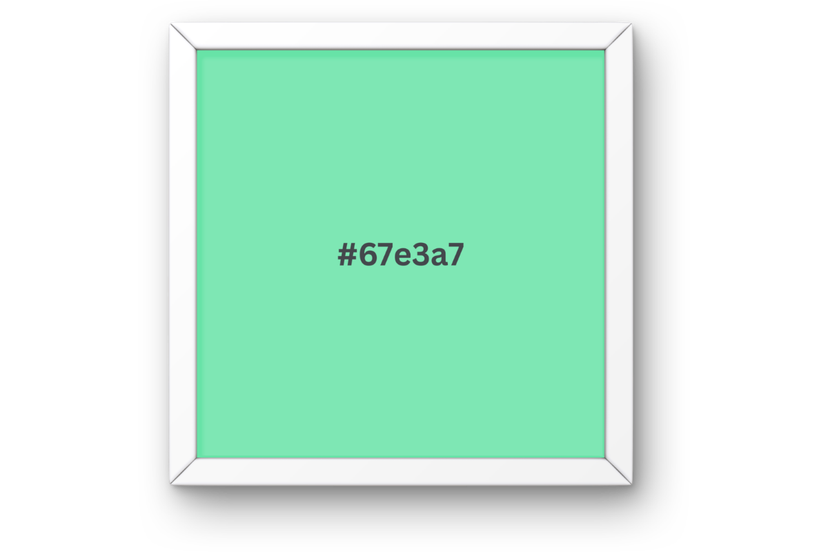
Colors

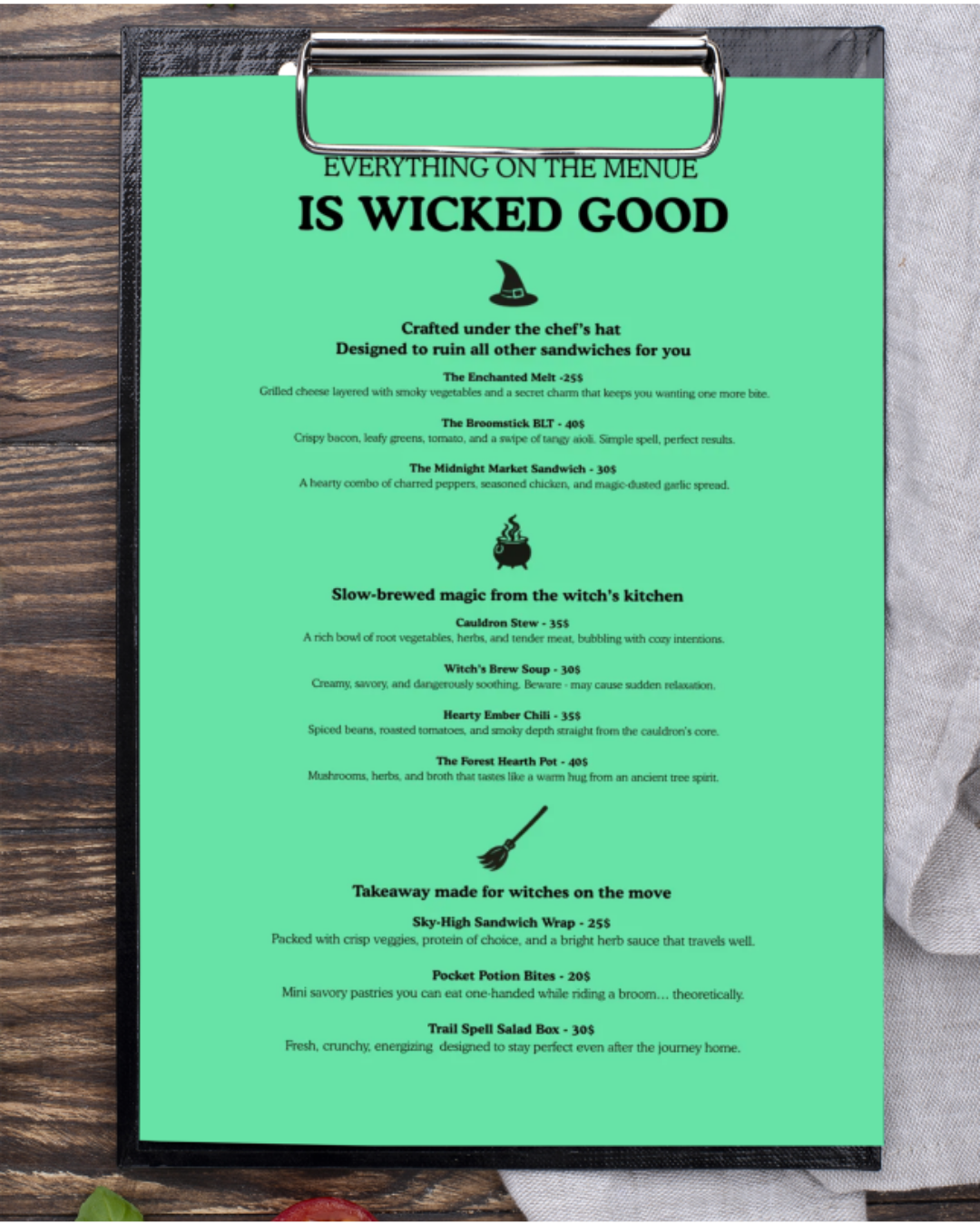
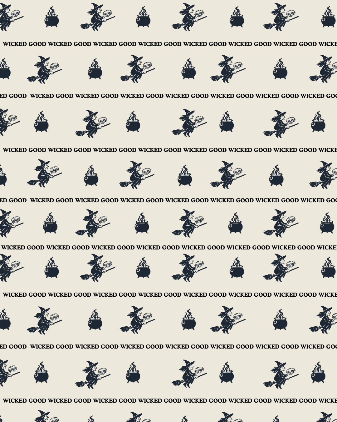
Icons

A custom icon system draws insperation from the world of magic and witchcraft, hinting at the “spellbinding” flavors behind each dish and enriching the brand’s visual storytelling.

Typography
A modern yet slightly enchanted typeface was carefully selected to complement the brand.
It remains clear and versatile while adding character across menus, posters, and all visual assets.
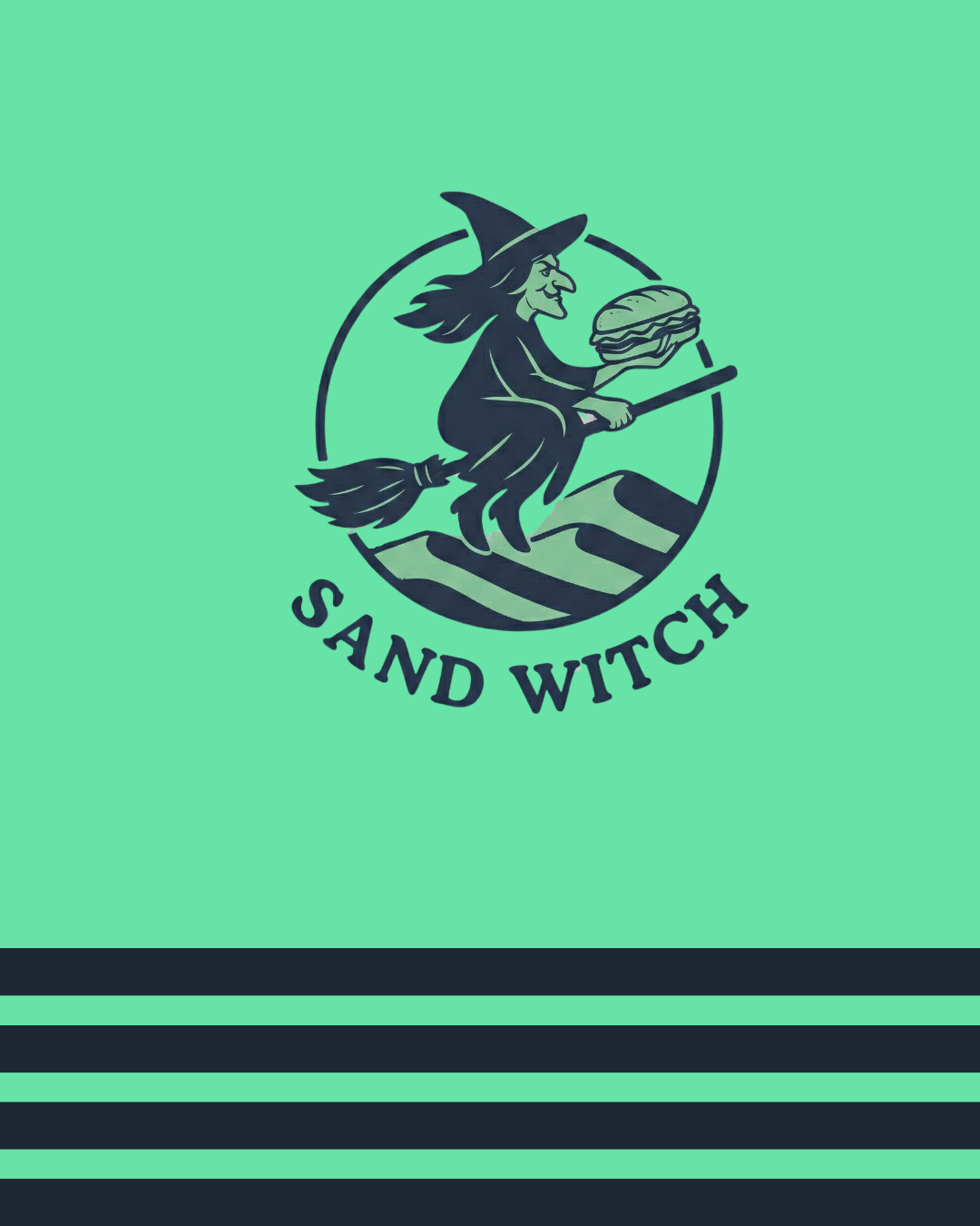

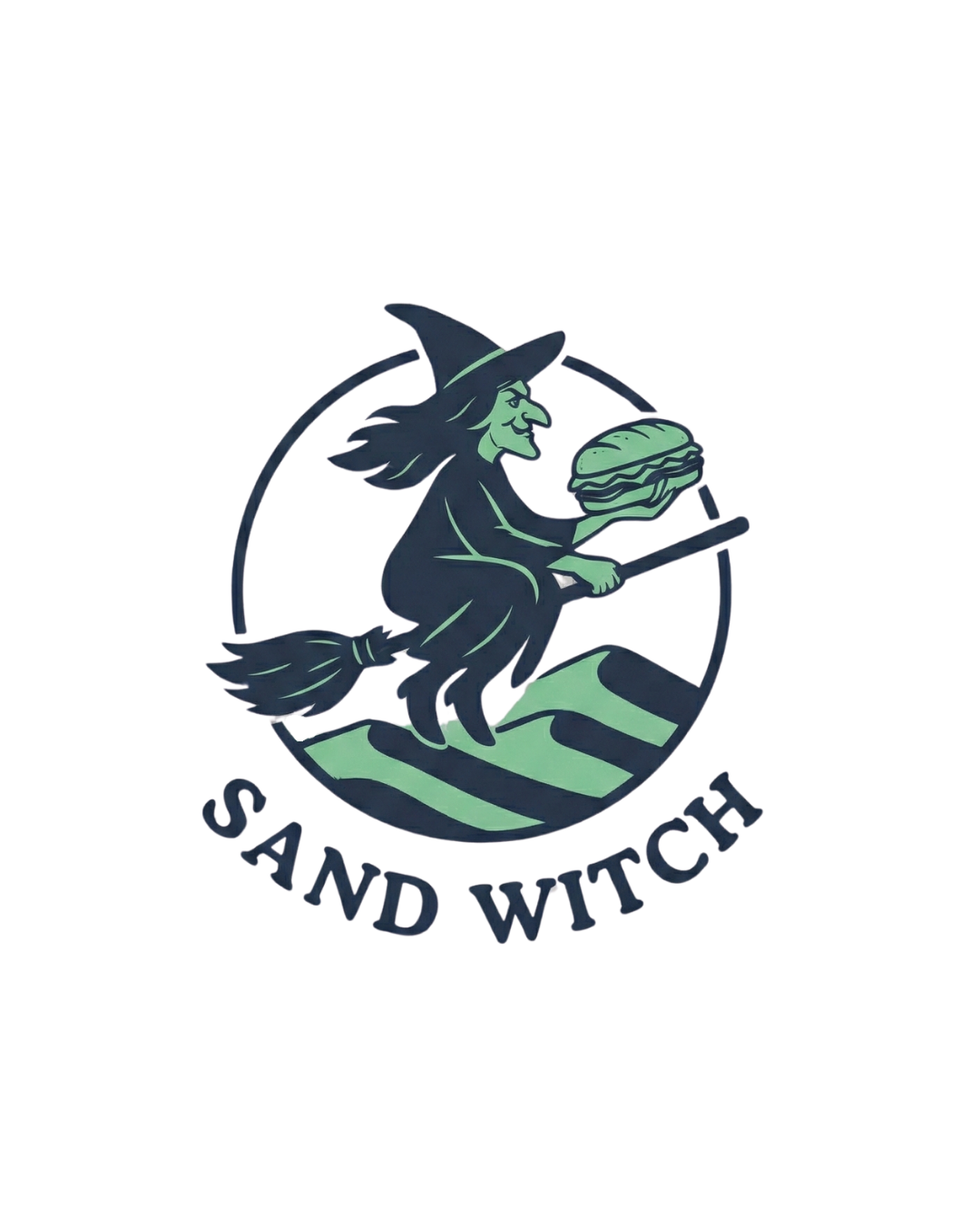
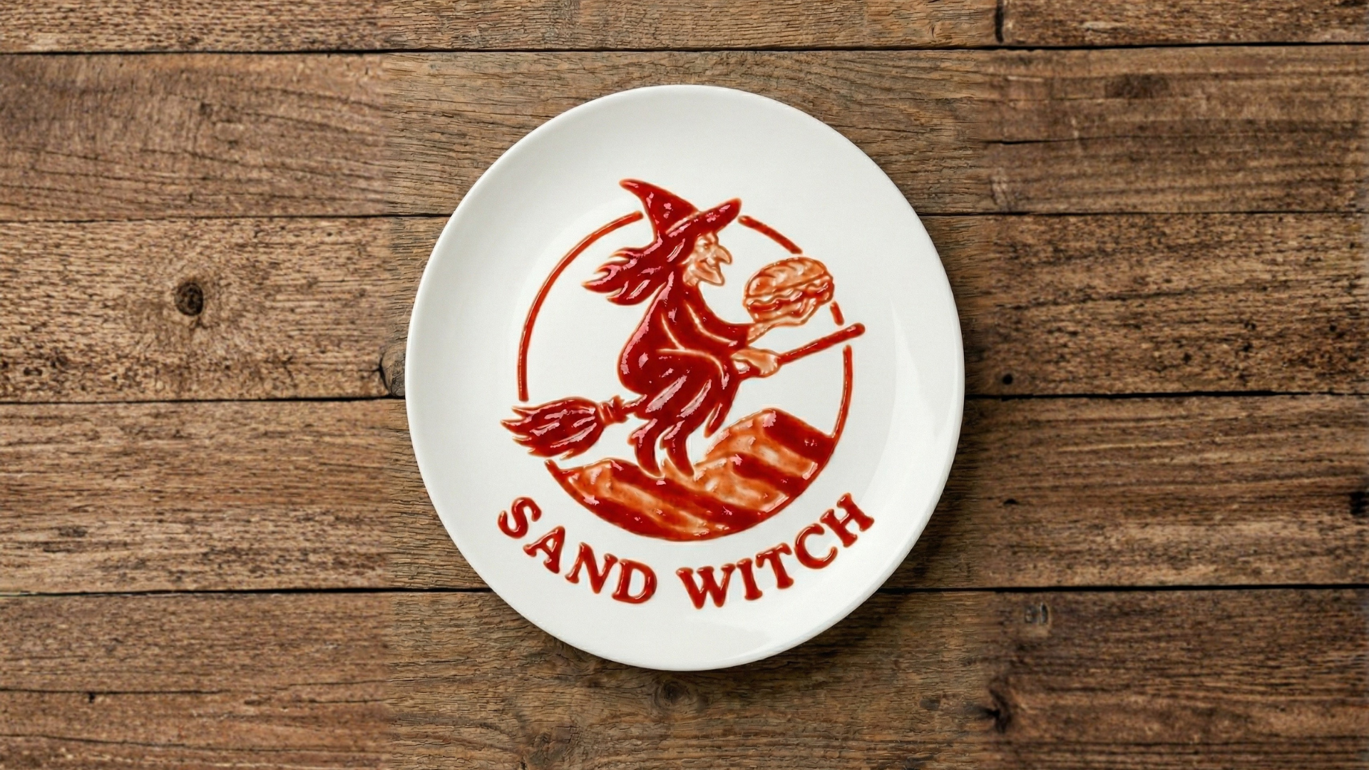
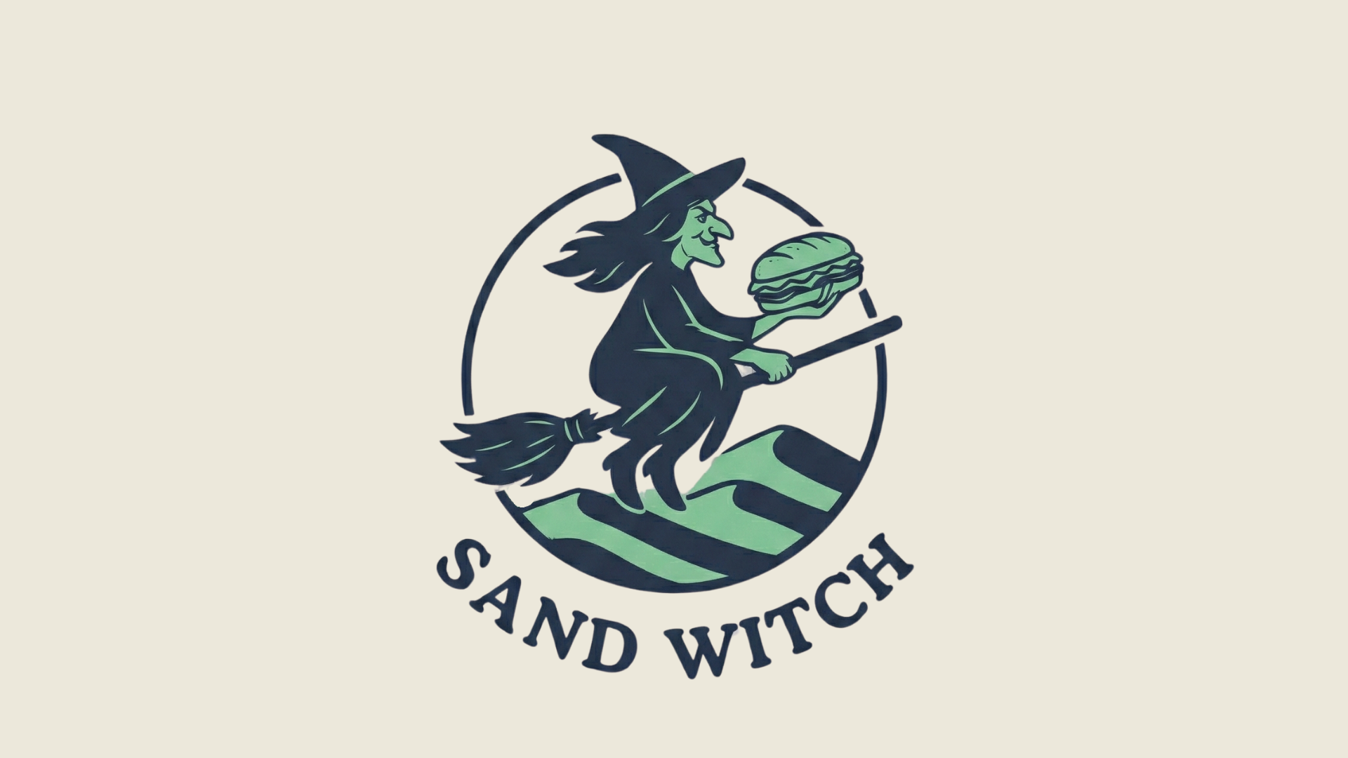
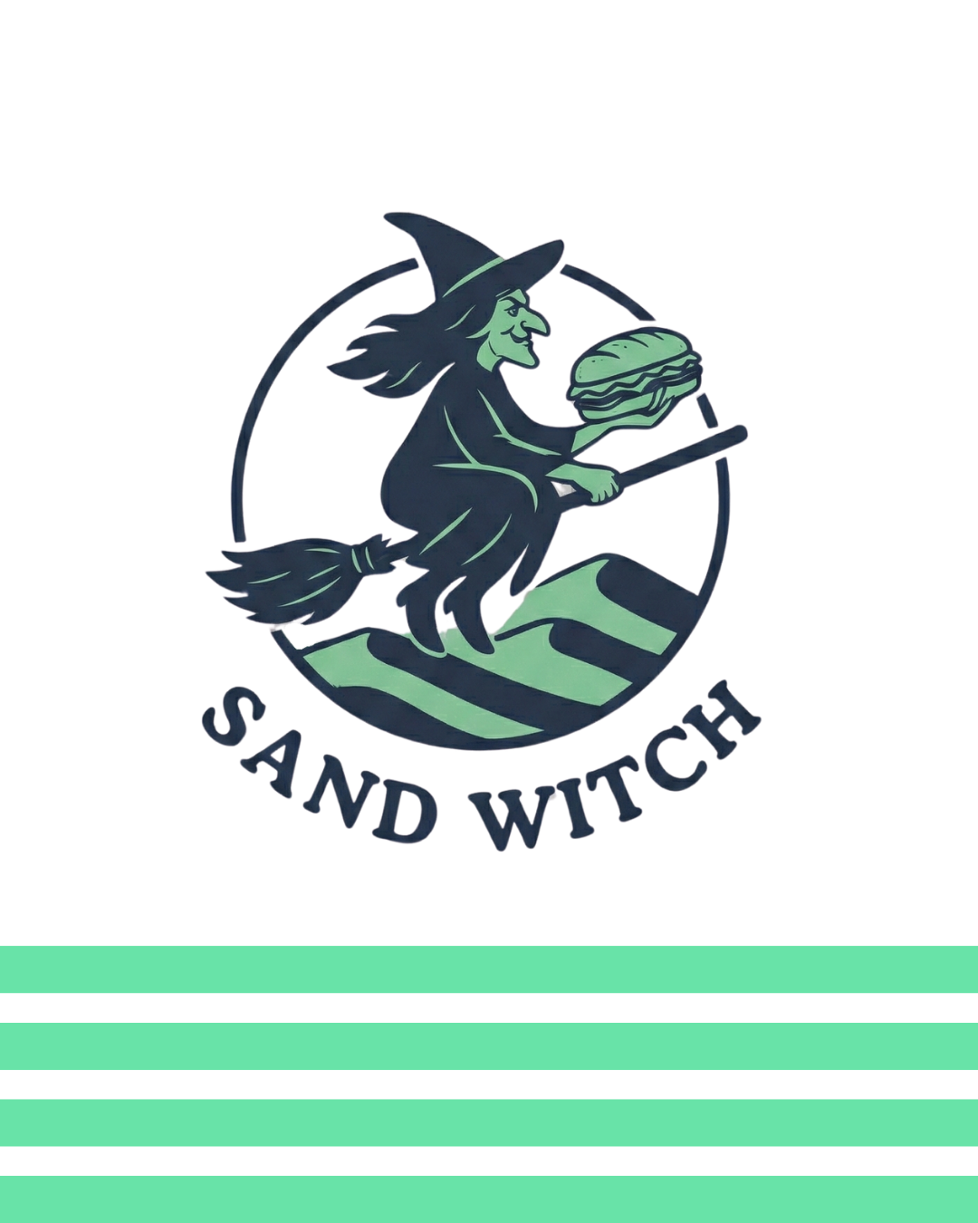
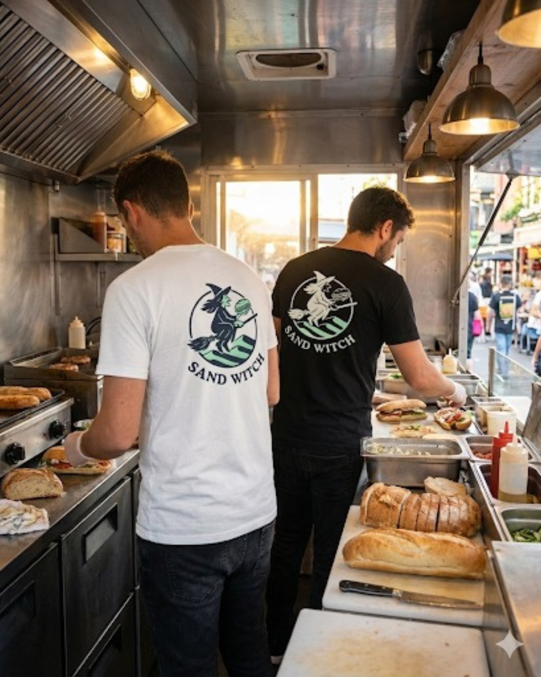
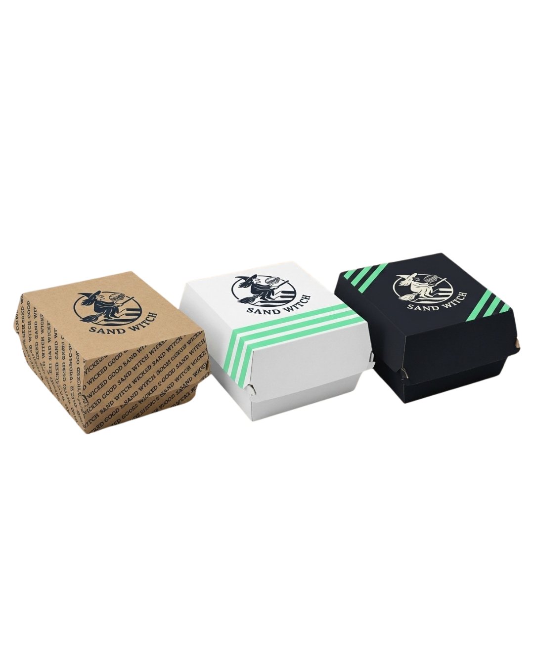
Logo
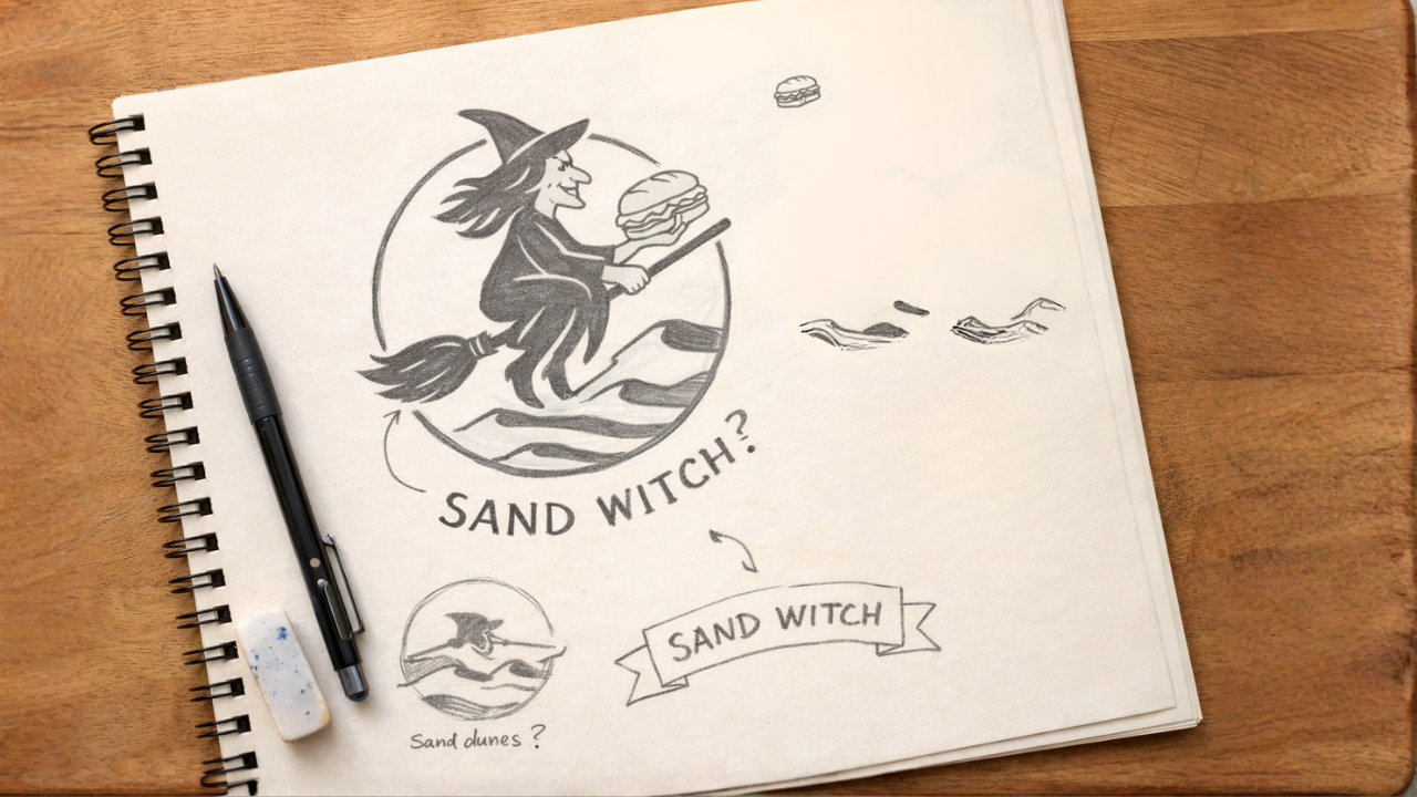
The logo features a witch flying on a broom over sand dunes.
A visual translation of the name Sand Witch, blending magic with a playful twist on the product itself.

Tone of voice
The language is witty, playful and full of wordplay, combining elements from both the culinary and magical worlds to create a charming and memorable voice.


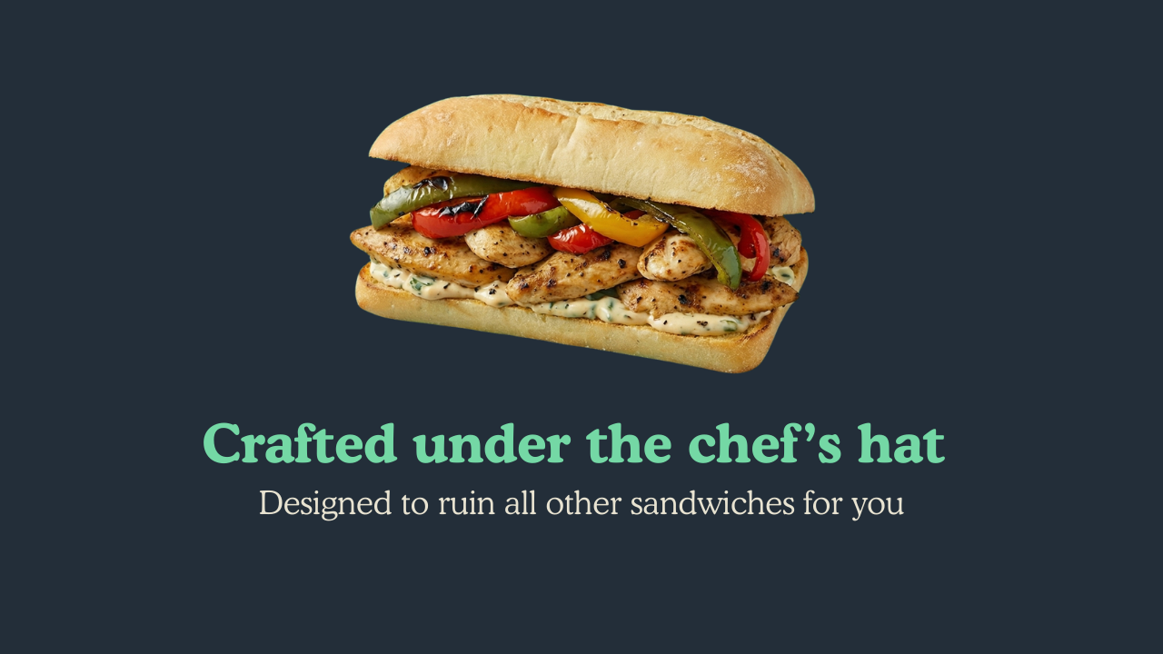
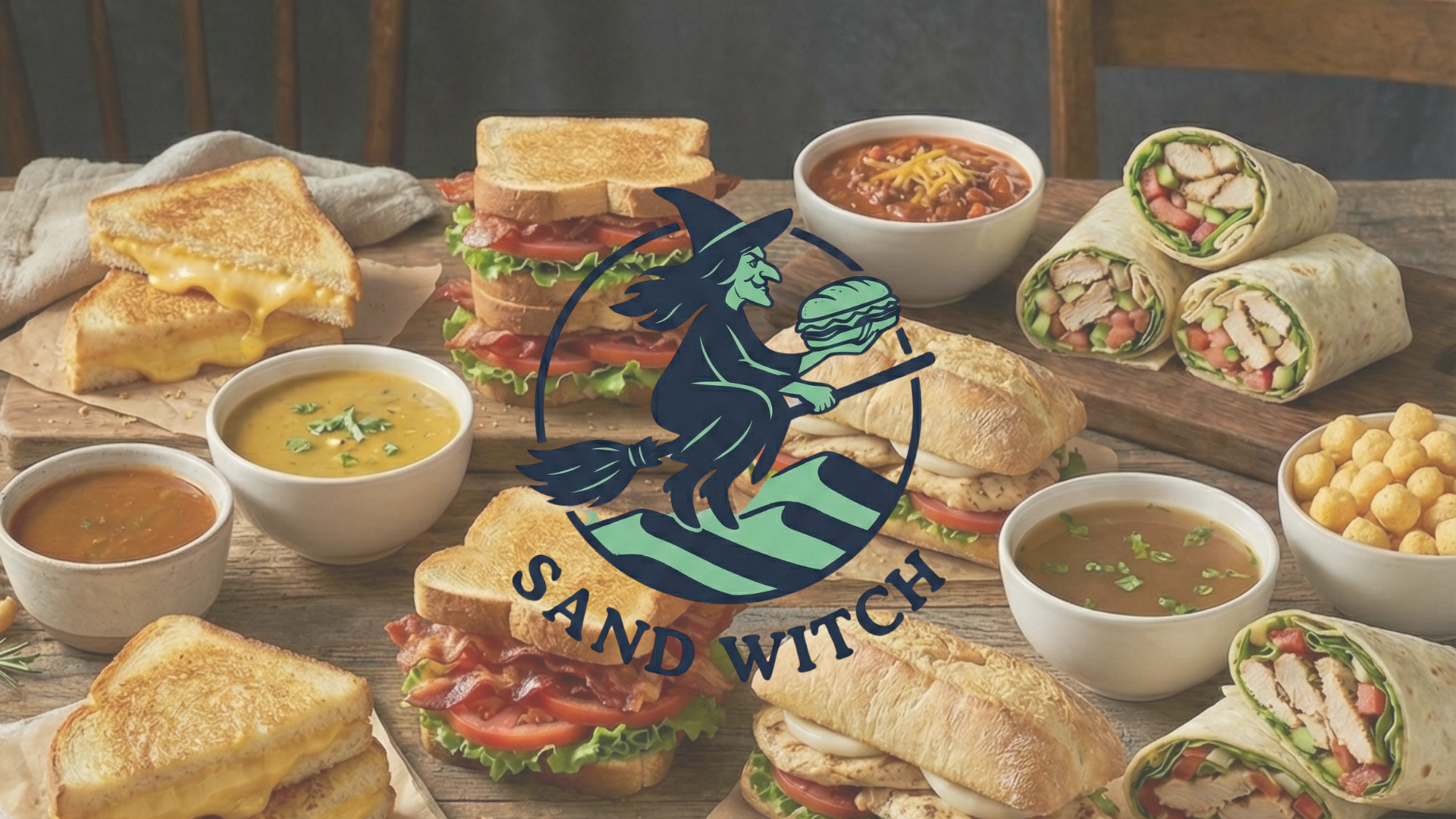
Images
The visual style is highly culinary, designed to highlight the food in an appetizing and elevated way.


Brand Promise
Beyond the visuals, the brand is grounded in one clear promise: the food is Wicked Good.
The magic only works if the experience delivers great taste is the foundation of it all.