Liba
Branding for a personal wellness method school
Liba is a personal development methodology and wellness framework designed to guide individuals through a structured journey of self-discovery, values, and intentional living.
This project was developed as a complete brand process, from research and strategic definition to a fully articulated visual identity.
#Design
#Creative
#Strategy
#Branding


The Process
The process began with an in-depth market and audience research, defining the brand essence, values, positioning, tone of voice, and strategic marketing direction.
1
I defined the target audiences, shaped the value proposition and core messaging, and built a clear communication framework to support future growth.
2
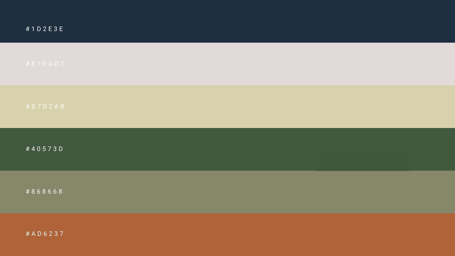
This strategic work was translated into a cohesive visual identity, including a logo, typography, color system, and foundational design language.
3
The final outcome: a comprehensive Brand Book that transforms strategy into a practical visual and communication system, ready for real-world execution.
4
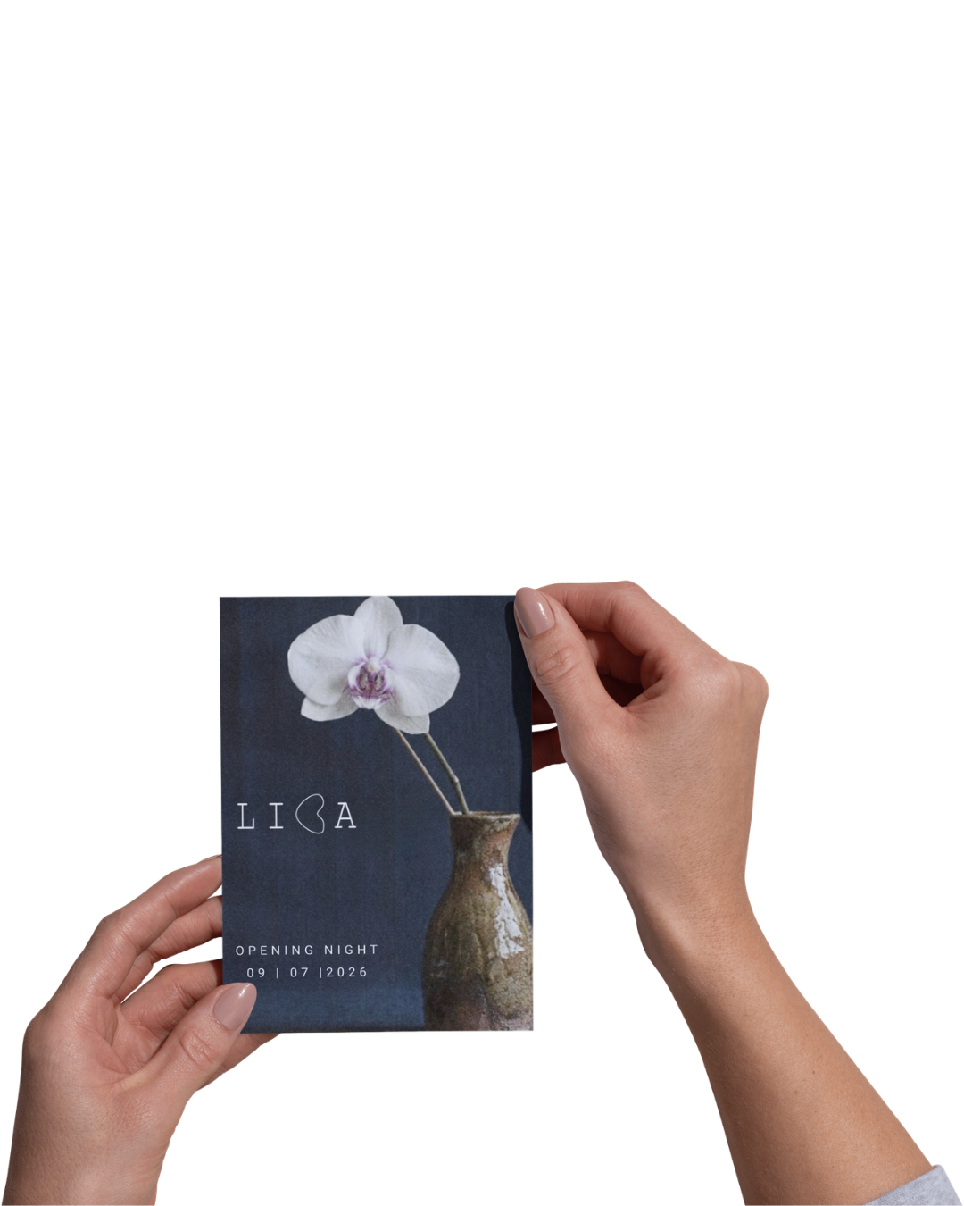
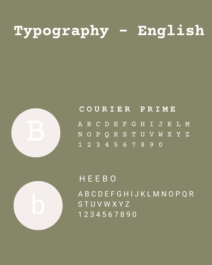
Typography
The chosen typography echoes old typewriter writing, symbolizing a return to the story already written within us so we can shape the one yet to come.
It reflects Liba’s values of clarity and honesty and was selected to maintain visual harmony in both Hebrew and English for a local and international audience.


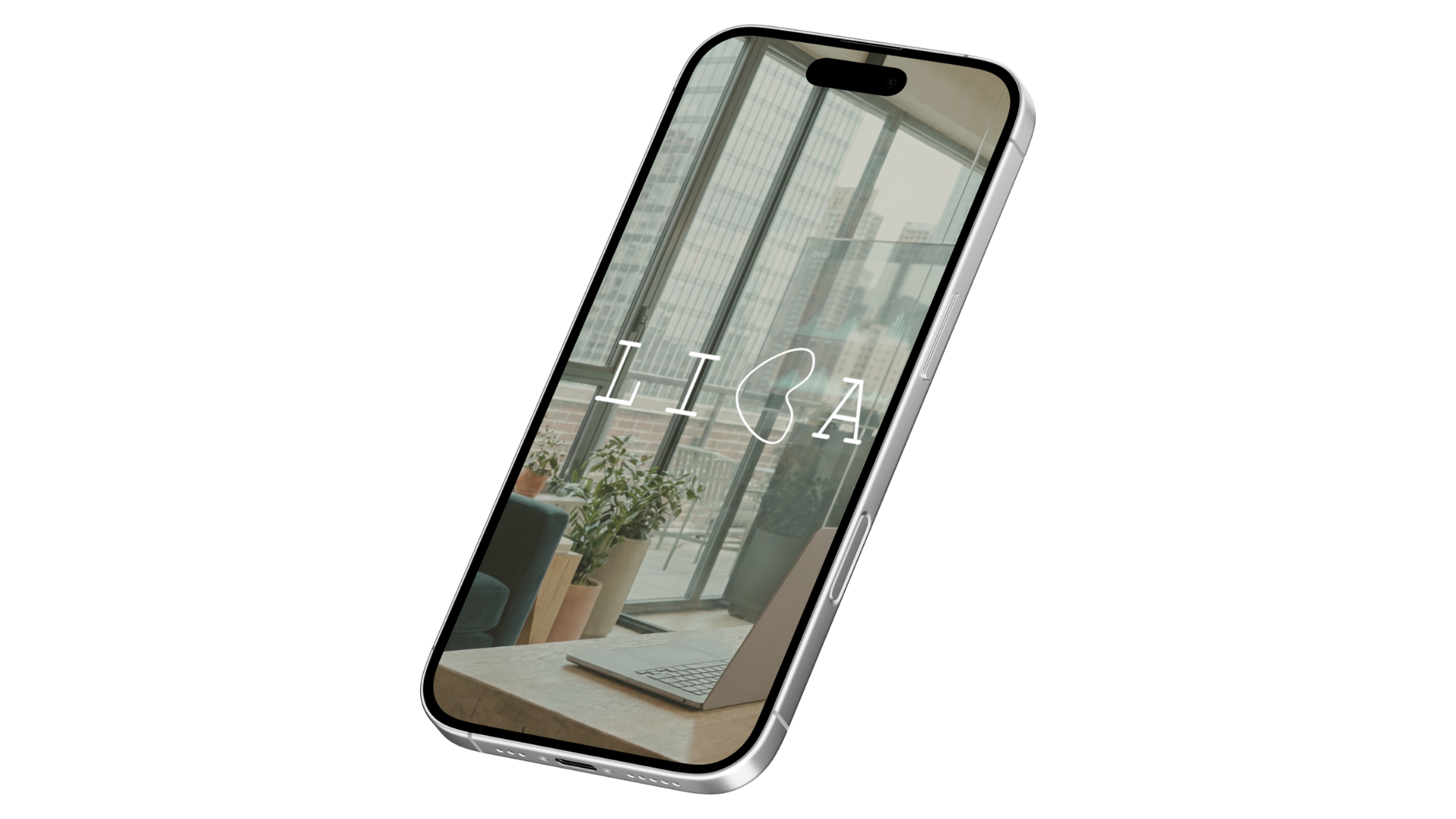
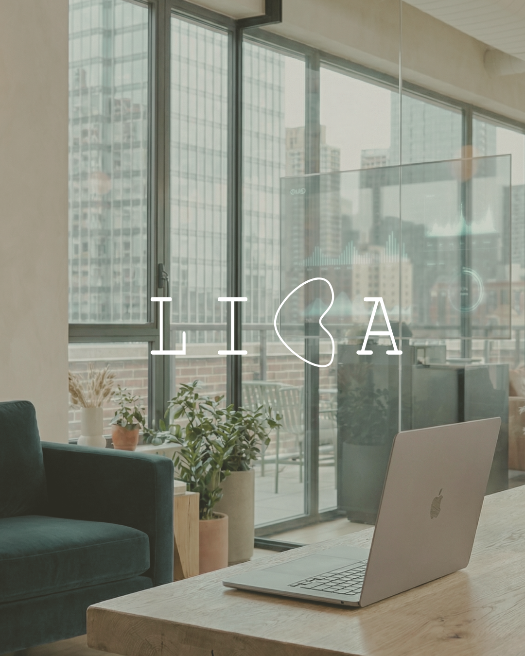
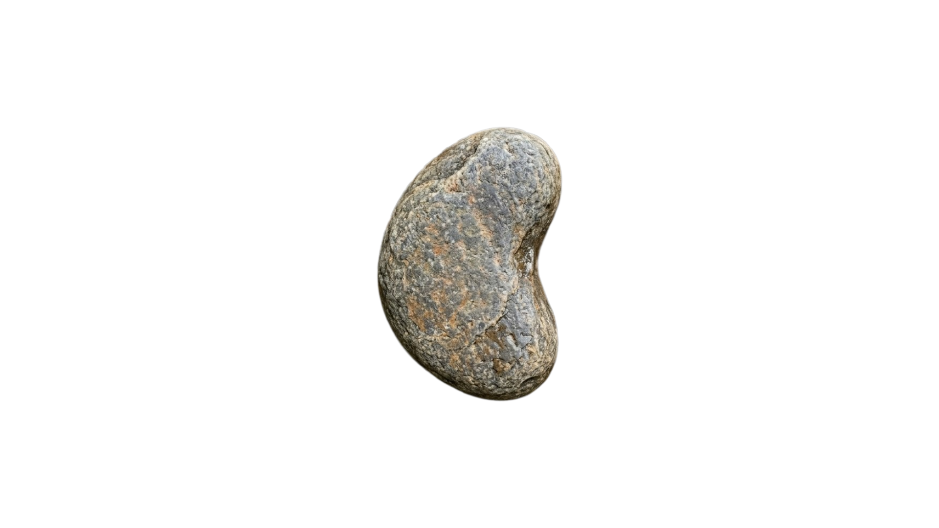
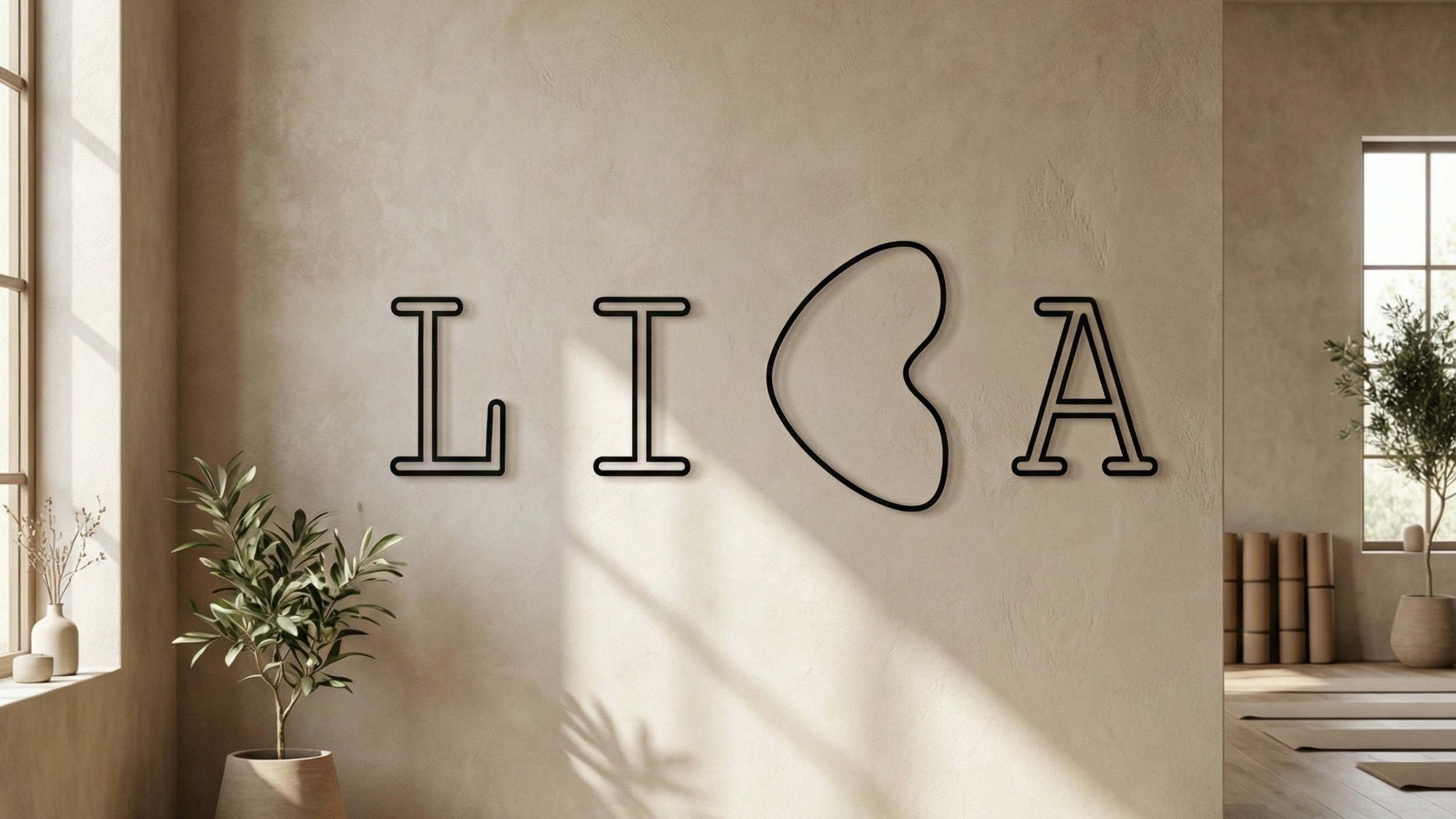
Logo
The logo was inspired by a river stone—a symbol of returning to our natural, foundational essence.
Its organic shape was transformed into the letter “B,” becoming the core of Liba’s visual identity.
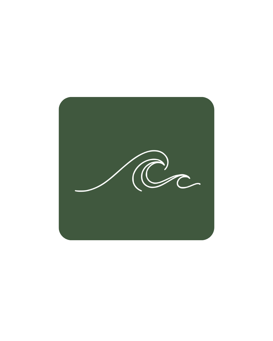
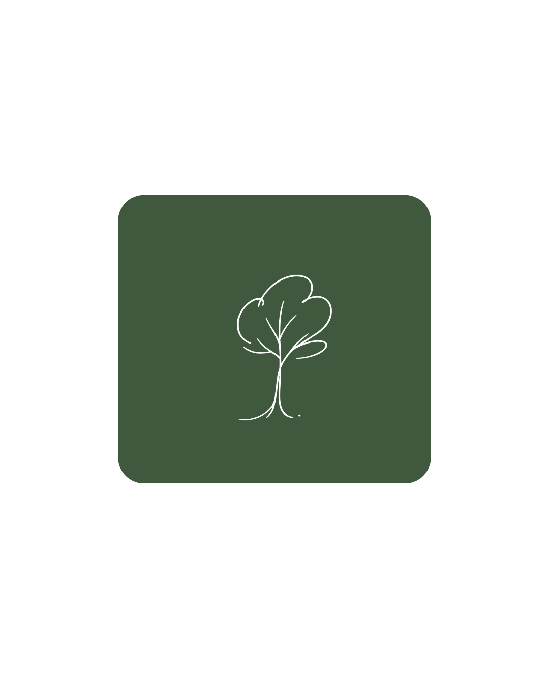
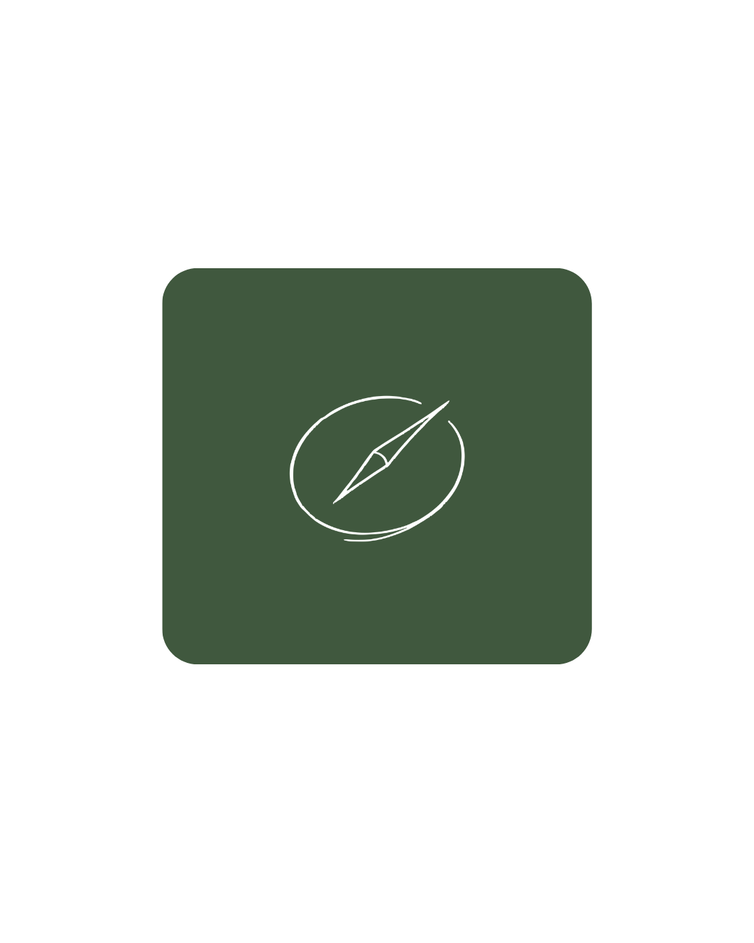
Icons
A cohesive icon system representing the stages of a personal journey toward self-discovery.
Each icon embodies a different value, intention, or inner milestone explored throughout the course, translating abstract emotional processes into clear visual symbols.


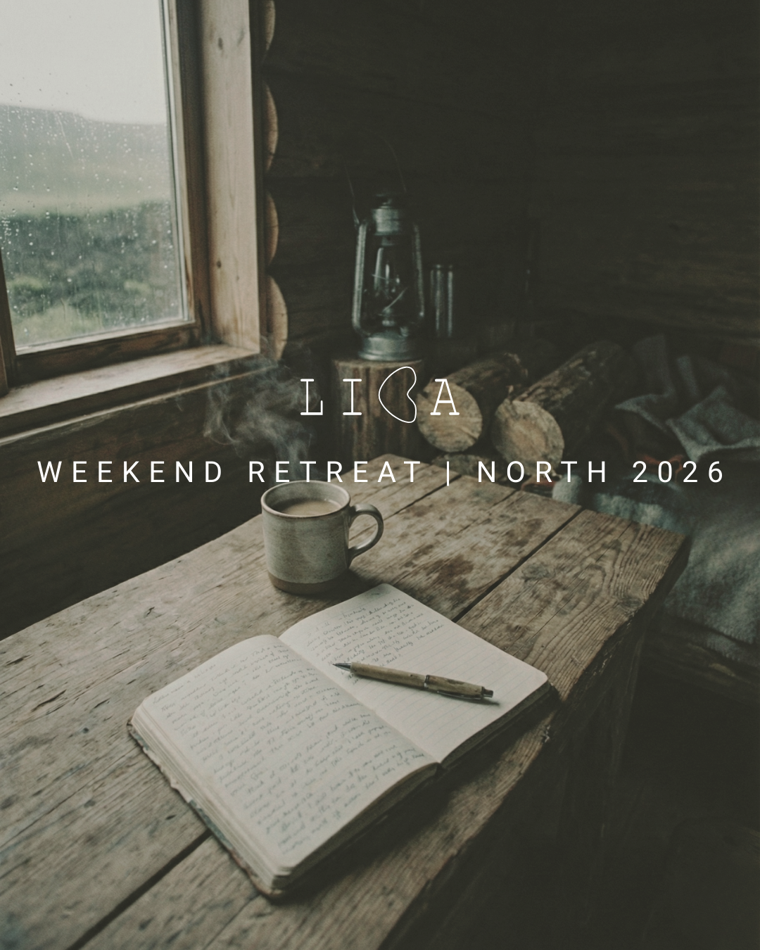
Social Media
I developed a cohesive visual language for Liba’s digital presence, ensuring the brand translates consistently across Instagram, YouTube, and future online courses.
The design system balances calmness and clarity with emotional depth, creating recognizable, adaptable assets that support both content creation and long-term growth.