Basir & Sons
Ideation and Brand book for a new traditional workers restaurant
A full end-to-end branding project for Basir & Sons, inspired by the culture of traditional Israeli workers’ restaurants.
The process included brand strategy, visual identity, tone of voice and a complete set of branded assets, from packaging and menus to social media and outdoor campaign materials.
#Creative
#Design
#Strategy
#Brandbook
Logo
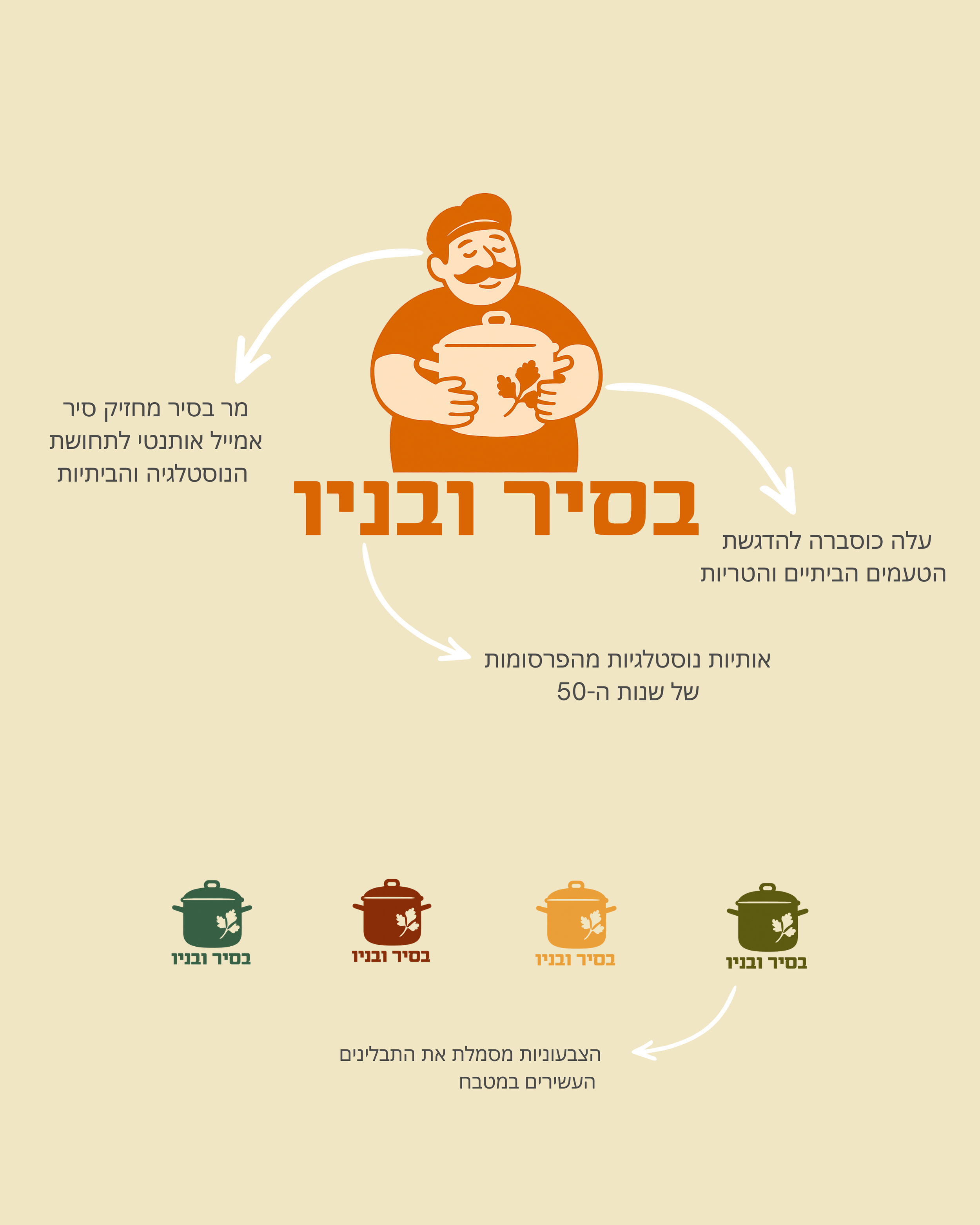
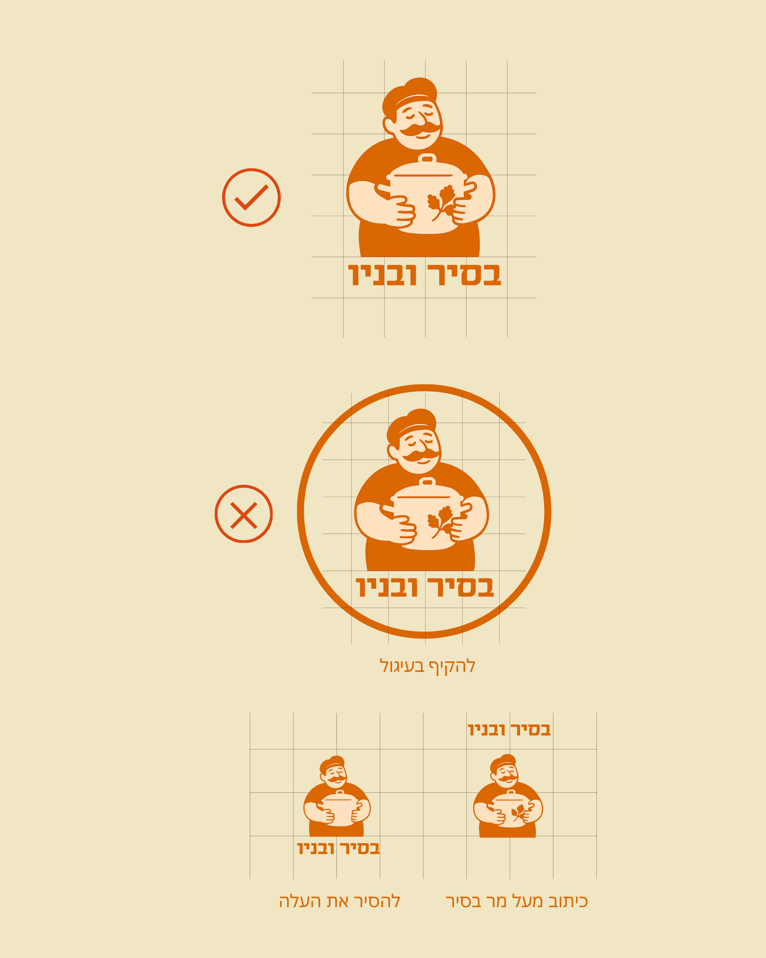
The logo is built around Basir, a grandfather figure whose name also echoes the Hebrew word for a cooking pot (sir).
He represents the heart of the kitchen and the tradition of homemade recipes.
Icons
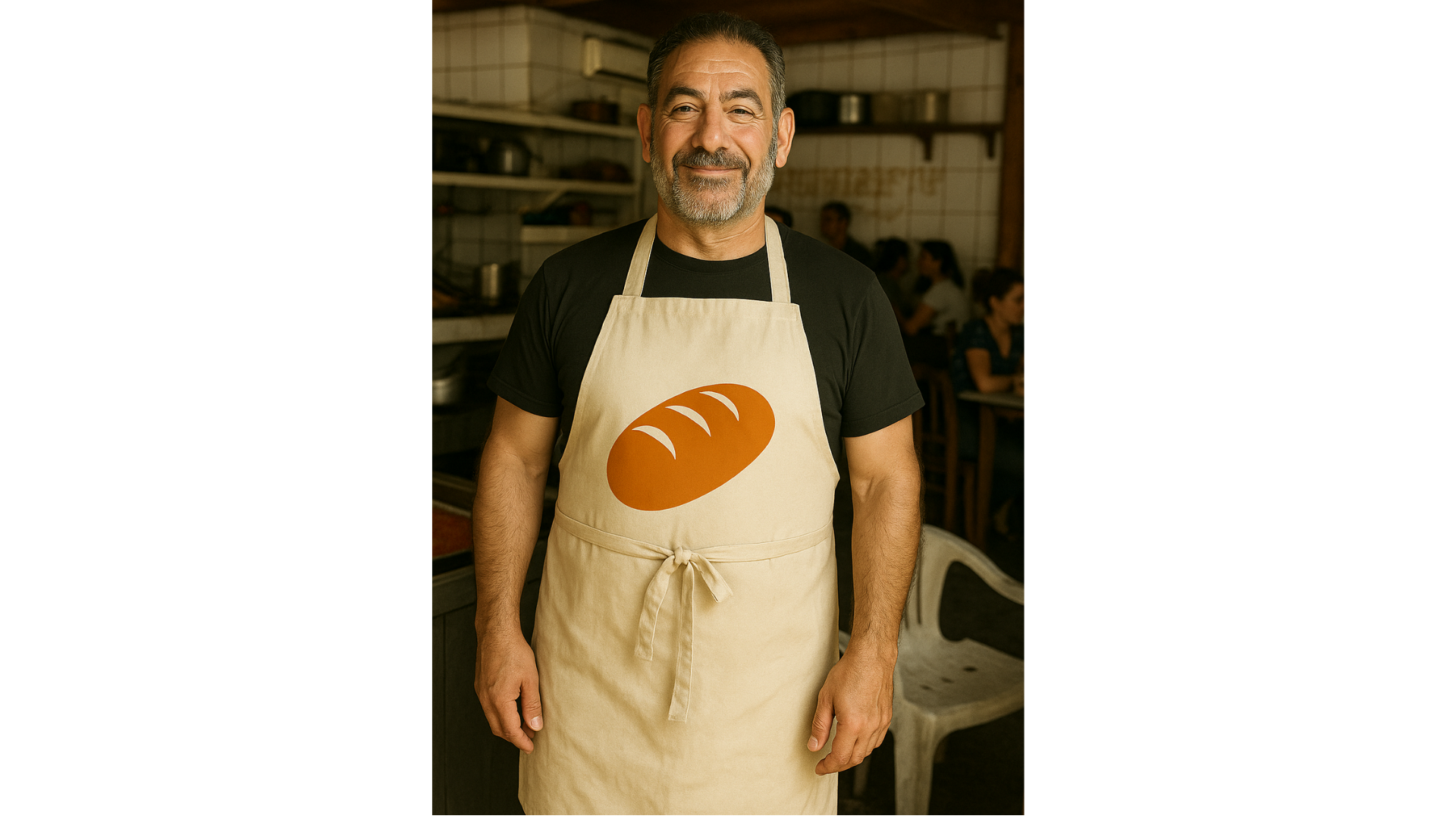
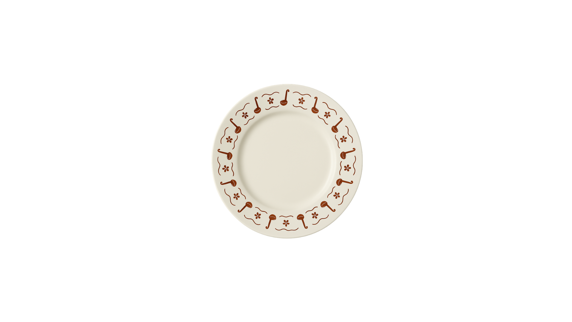
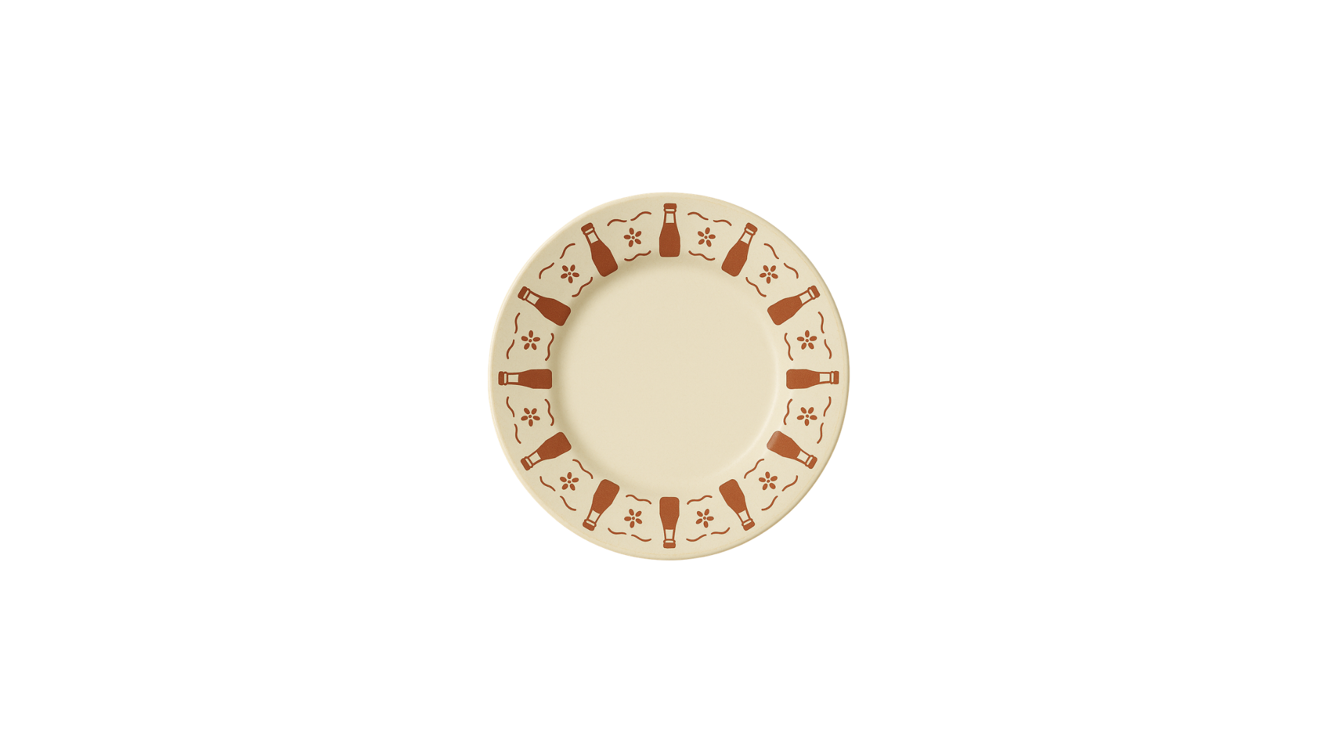
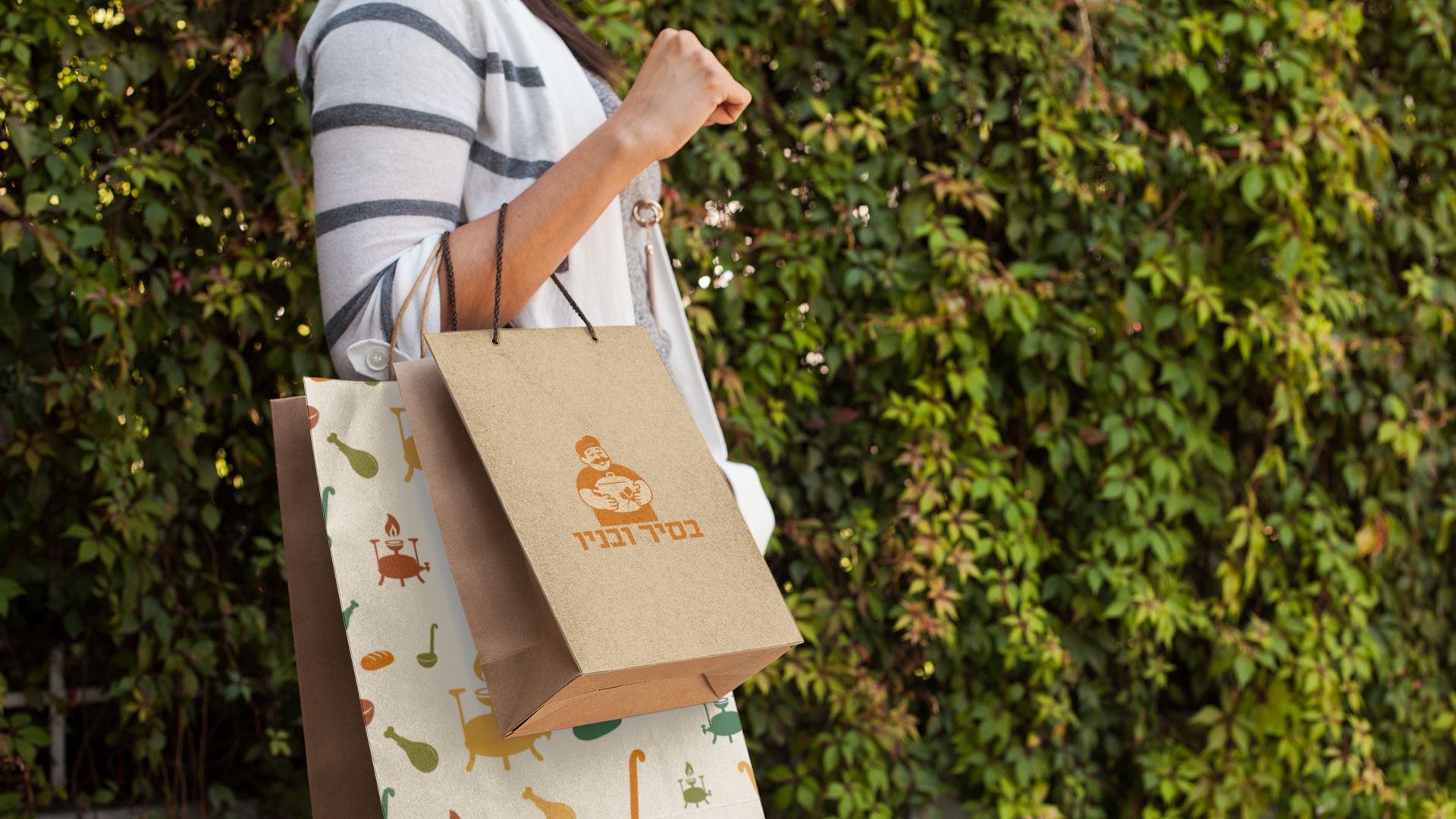
The icon language extends into branded products like plates, aprons and hats, transforming everyday kitchen items and traditional foods into recognizable brand elements.


Colors & Typography
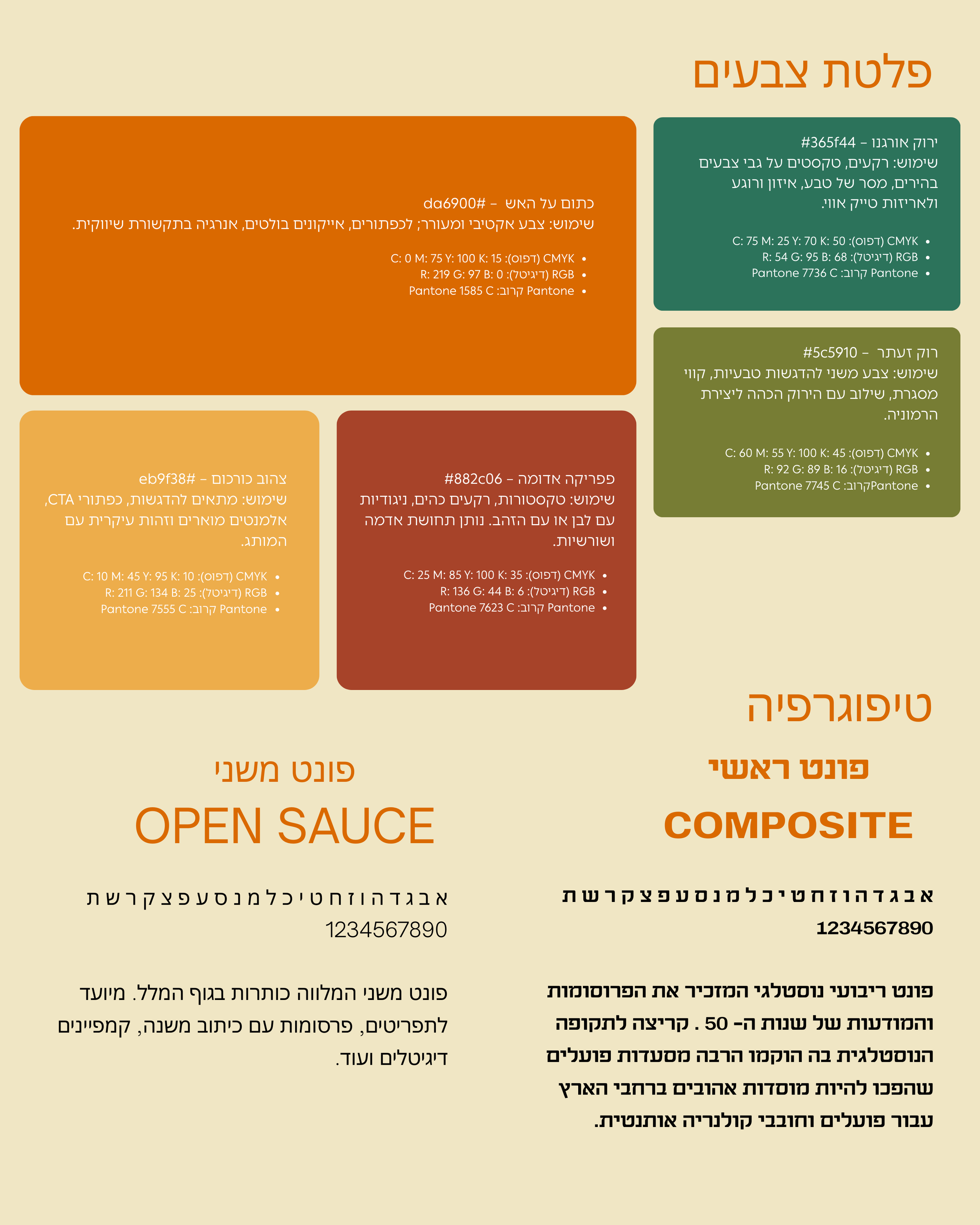
The palette is inspired by the kitchen and the market: turmeric yellow, paprika red, and fresh green. These colors capture the warmth, spices, and richness of home-cooked food.
supported by carefully selected Hebrew typography that is clear and readable while echoing a subtle retro aesthetic.
Branded Items
A custom icon system celebrates the symbols of workers’ restaurants from hamsas and chai necklaces to vegetables, poultry, and cooking tools.







Packaging

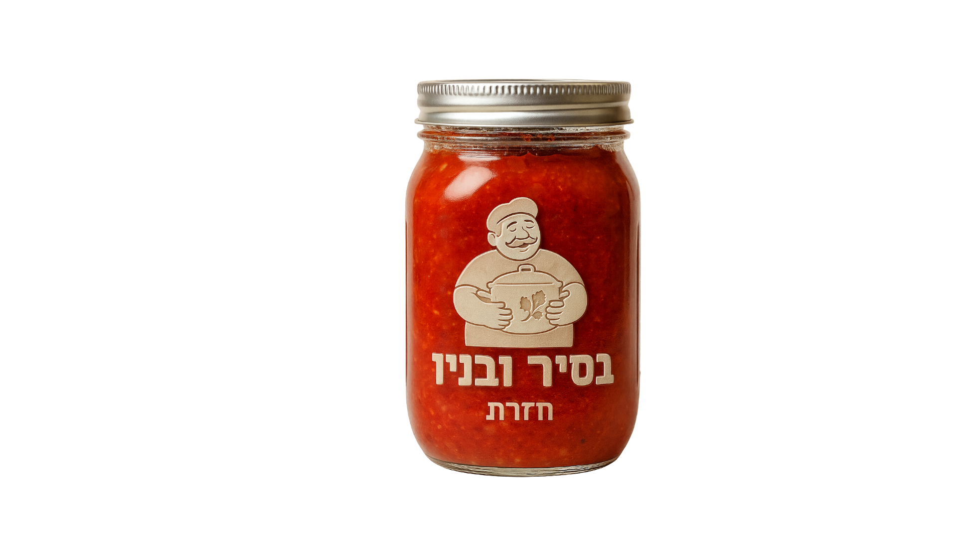
Original packaging was created for laffa wraps, lachuch and house preserves in glass jars, all carrying the brand’s colors, icons and typography.



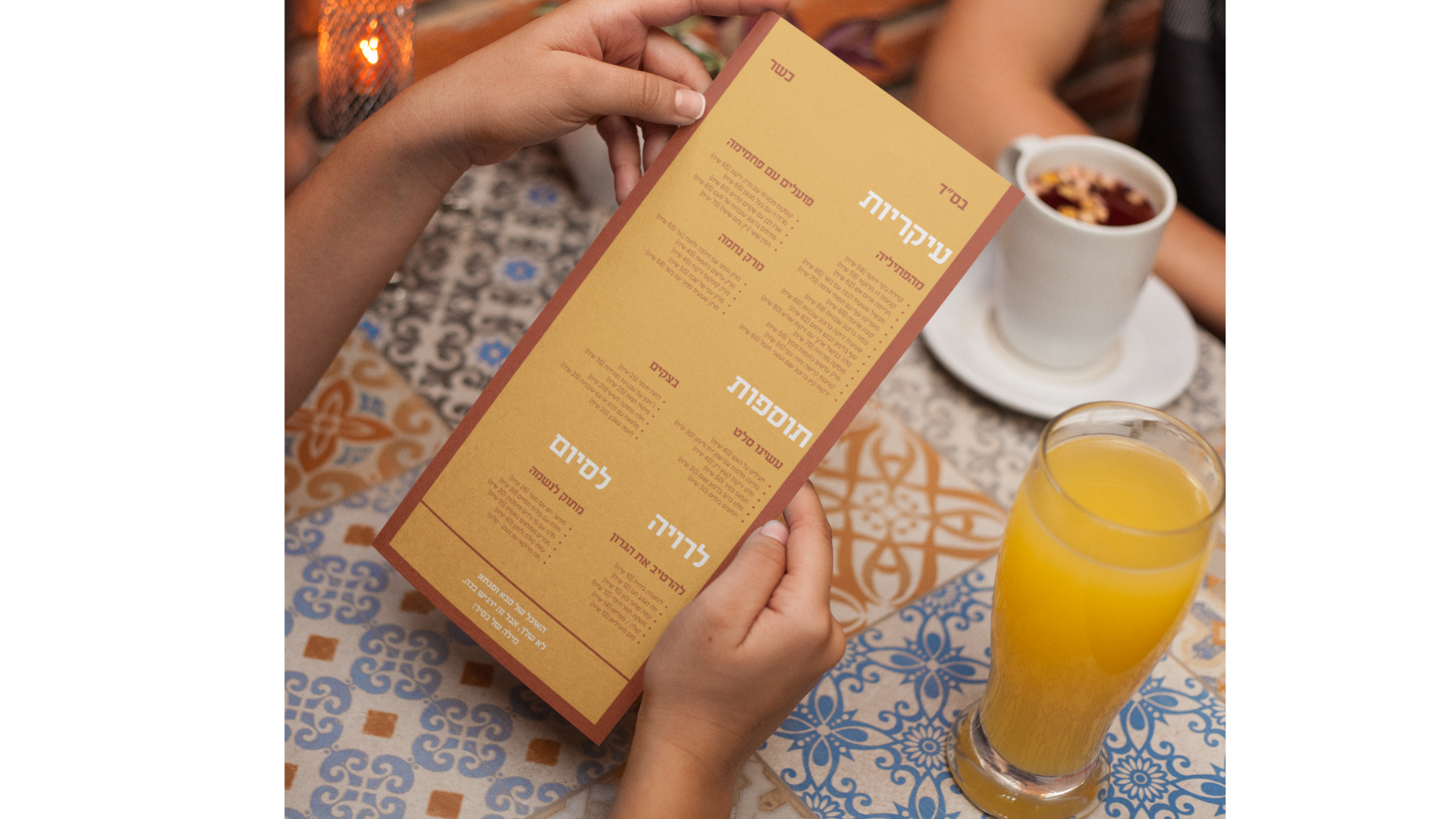
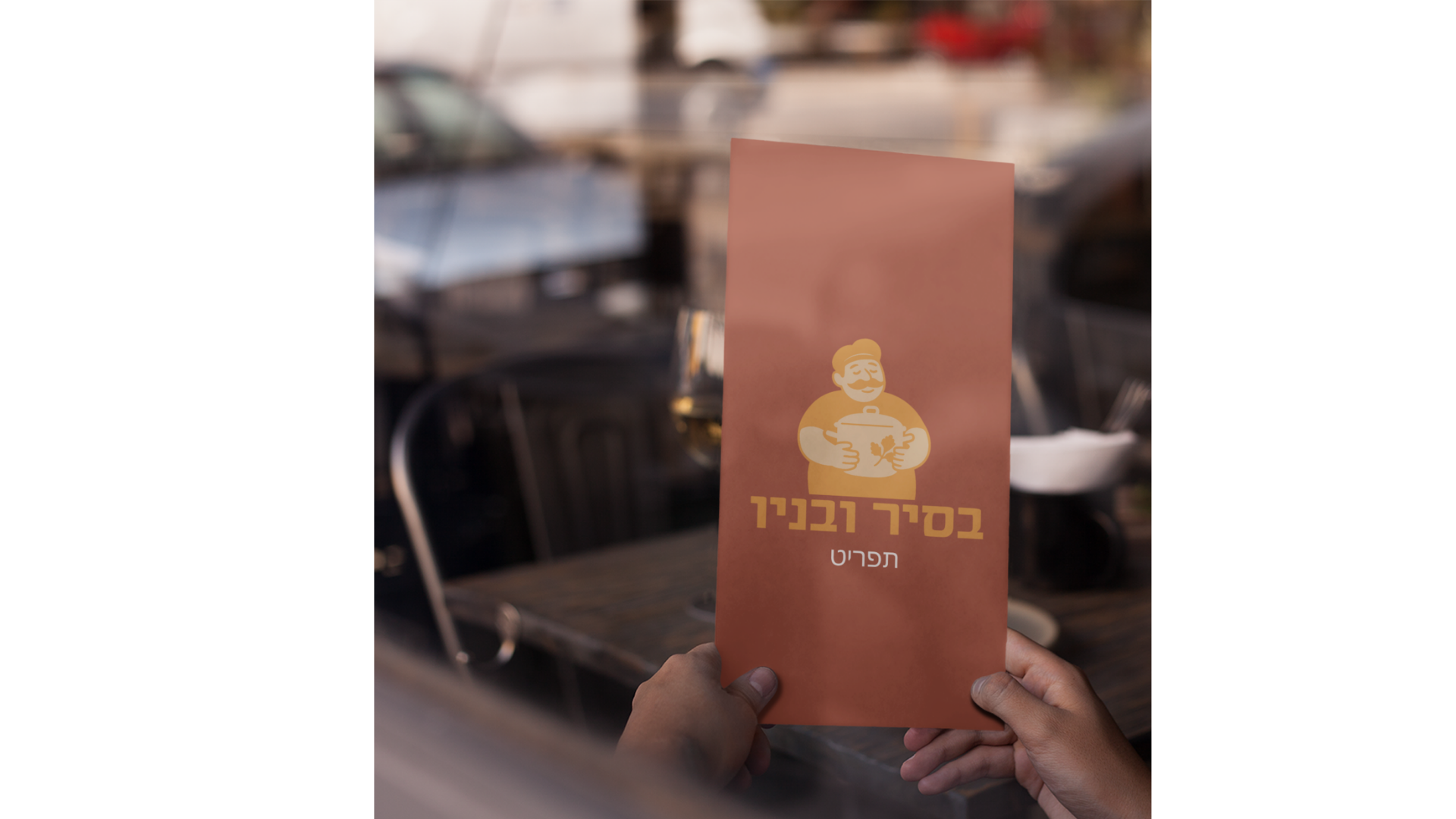
The menu uses witty, home-style slang with playful wordplay and subtle humor, reflecting the personality of the kitchen and the spirit of the brand.
Menu
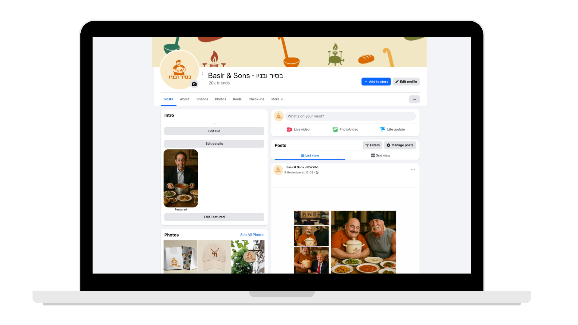
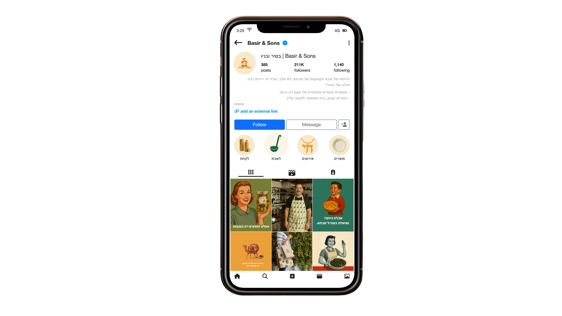
Social templates and food visuals continue the brand’s warm and playful tone, creating a lively presence across Facebook and Instagram.
Social Media
Campaign
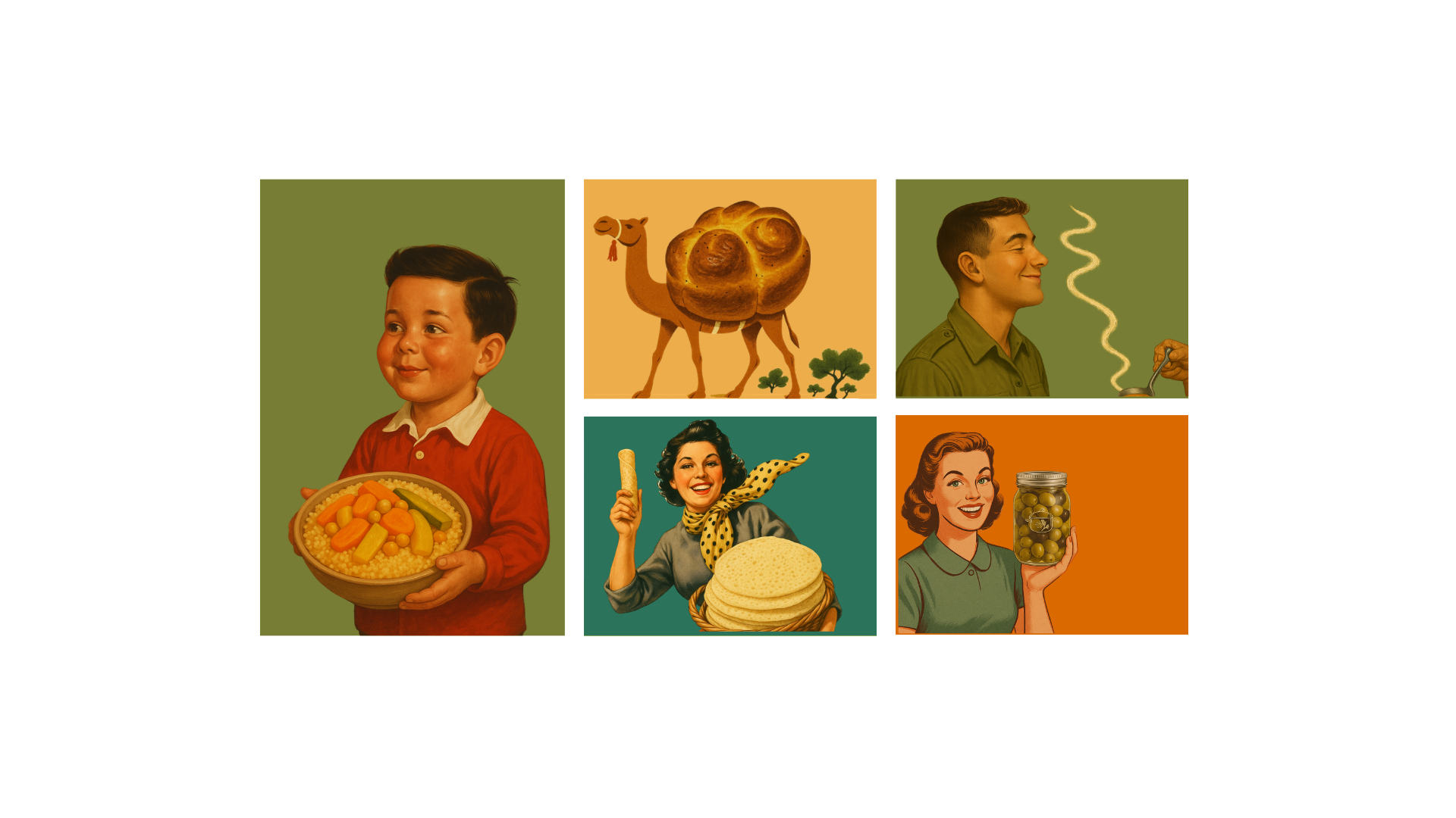
The campaign draws inspiration from vintage Israeli ads, using nostalgic illustrations and playful headlines to celebrate the joy of home-cooked food.